05 — Approach & Process
How I got from
How I got from
chaos to foundation.
1
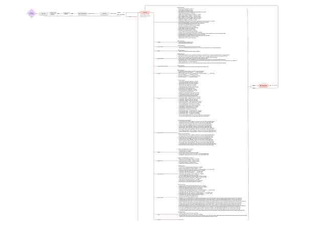
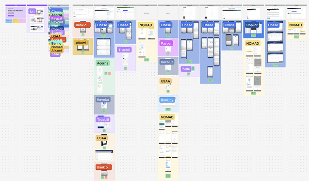
System mapping
Started by mapping the full platform from scratch — flows, dependencies, and gaps —
before any design decisions were made.
Full platform mapped before any design decision — each page, flow, and dependency documented
2
User research
Together with Lorenna and Will, conducted interviews with both bank employees and
their clients — giving us visibility into operational and user-side challenges at the same time.
3
Usability testing and benchmarking
Validated pain points through usability testing and benchmarked similar financial
solutions to identify patterns worth adopting.
Competitive benchmarking — patterns from similar financial products that informed design decisions
4
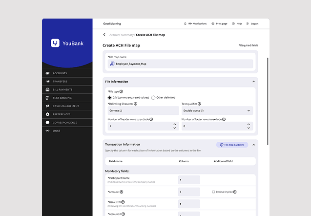
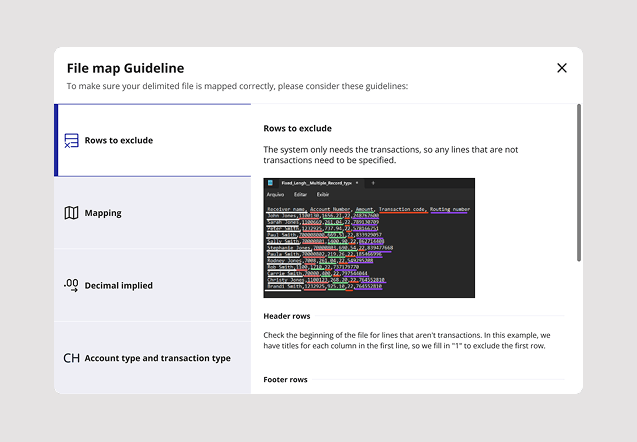
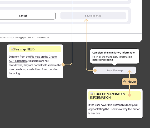
Workflow redesign
Focused on batch payments: replaced manual inputs with structured selections,
introduced dropdowns to prevent errors, improved file upload feedback, and added contextual guidance and
tooltips throughout.
5
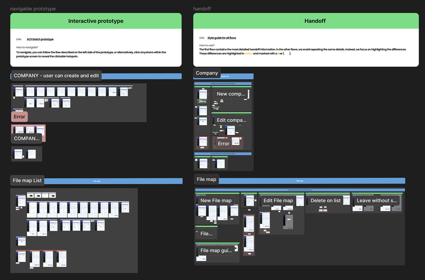
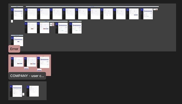
Prototyping and testing
Built prototypes and validated with users. Testing revealed small but critical
improvements that increased confidence and reduced errors in real operations.
Prototype structure in Figma — organized flows ready for usability testing
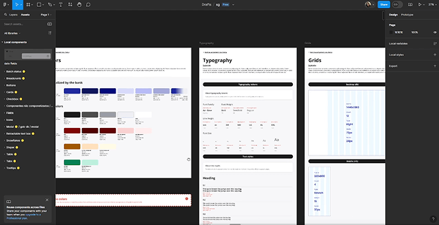
6
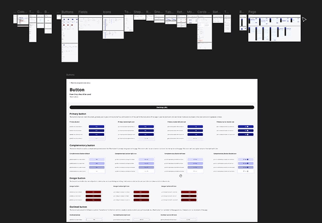
Building the design system
As components grew, the need for shared foundations became clear. Together with
Lorenna and Will, we created a style guide that evolved into a full design system — enabling consistent UI
patterns, faster decisions, and better collaboration with development.
7
Handoff and delivery
Delivered structured documentation covering component usage, interaction patterns,
error states, and logic — supporting smooth implementation without constant back-and-forth.