Driving Lead Growth
Through a Smarter
Contact Flow.

Redesigning a contact flow to reduce friction and increase qualified leads.

Role
Senior Product Designer
Collaborators
Sales · Marketing · Development
Context
Internal project · B2B lead flow
+22%
Increase in form completions
−71%
Reduction in irrelevant submissions
8
Usability test participants
Cleaner data for the sales team
01 — At a glance

Everything you need
to understand this project.

Company US-based software consultancy offering two services: Team Allocation (designers and developers embedded into client teams) and Project Delivery (scoped solutions delivered with the client's PM).
Project Redesign the website contact flow to reduce irrelevant submissions and increase the number of qualified leads reaching the sales team.
Role Senior Product Designer — led all research, wireframing, prototyping, and documentation. Supported by the sales and marketing teams throughout.
Goals Increase qualified leads · Reduce irrelevant submissions · Clarify navigation labels · Improve data quality for the sales team
Process Self-audit · Behavior data · Interviews · Usability testing · Benchmarking · Wireframes · Async critique · Prototype · Round 2 usability testing · Handoff + Confluence docs
Outcomes +22% form completions · −71% irrelevant submissions · Smoother internal process reported by stakeholders

Note: The company name has been omitted at the request of my former lead. This work has been approved for publication.

02 — Problem

A contact form that let
everyone in.

The company had two ways to bring in new clients: the sales team reaching out on LinkedIn, and potential clients finding them through the website. The website contact forms were underperforming — receiving too many irrelevant submissions from people applying for jobs, promoting their own services, or making general inquiries.

That noise made it harder to find real business opportunities. The goal was clear: increase the number of qualified leads.

What was coming in
Job applications, service promotions, and general inquiries — clogging the pipeline with off-target submissions.
What the business needed
Qualified leads reaching the sales team — real business opportunities, not noise to filter through.
03 — Understanding the Problem

Three navigation items.
Zero clarity.

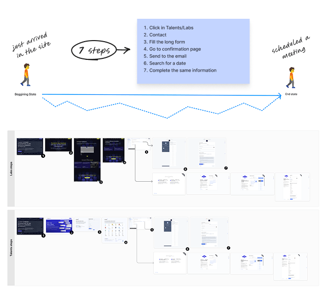
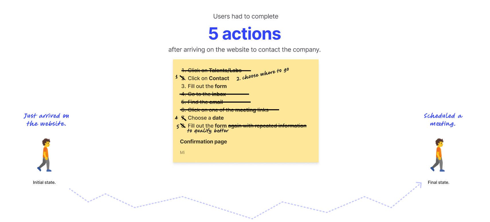
I started by acting as a potential client and going through the entire flow myself. The website had three navigation items: Talent / Labs / Contact. Two questions came up immediately: What is Talent? What is Labs?

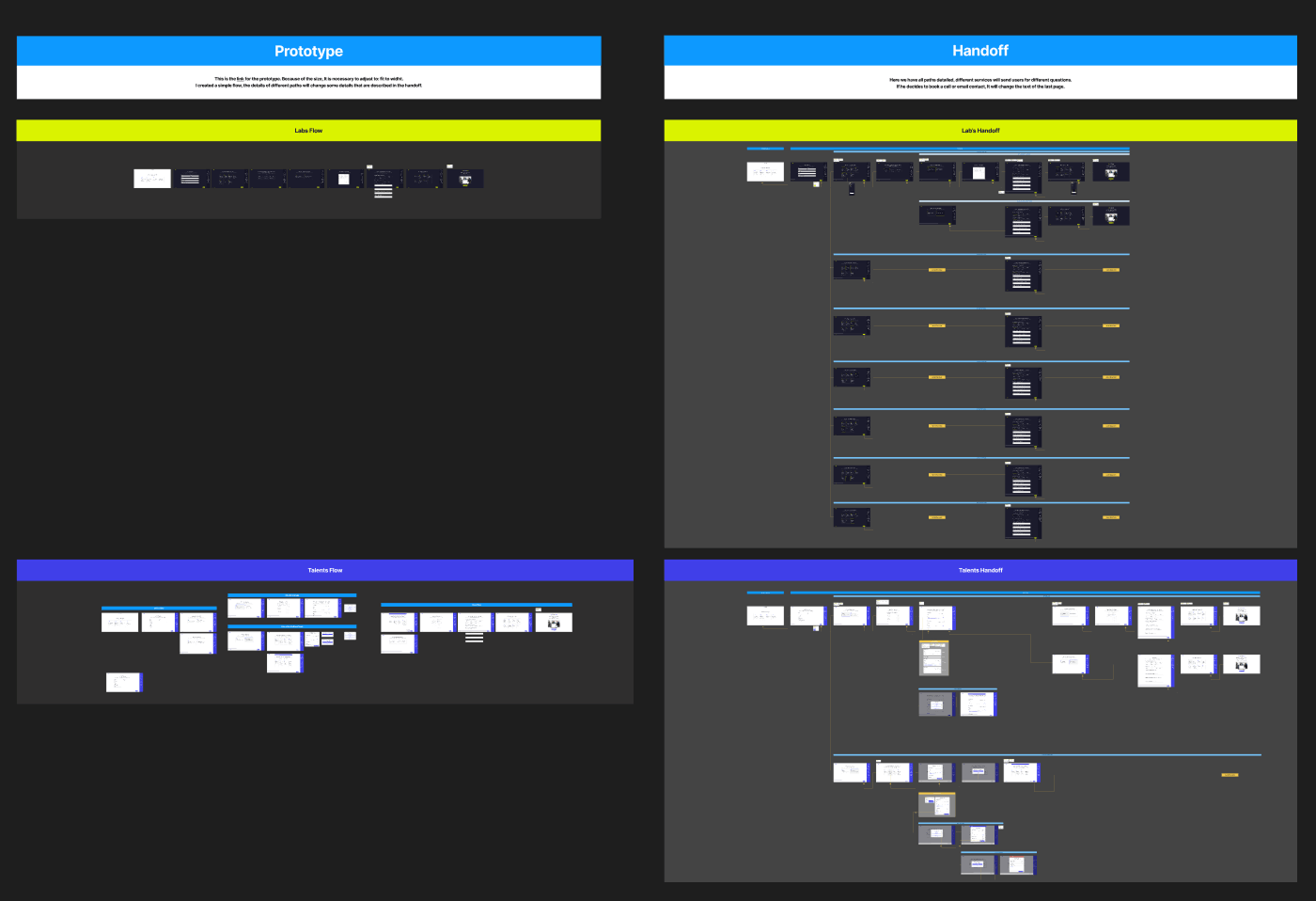
Talent was the team allocation service. Labs was project delivery. The labels made sense internally — but meant nothing to people outside the company.

Behavior data confirmed it. Talent had significantly more traffic than Labs — which was strange, since demand for Labs projects was actually higher. My hypothesis: the general contact flow was directing people to the Talent page before identifying their intent, inflating that page's numbers.

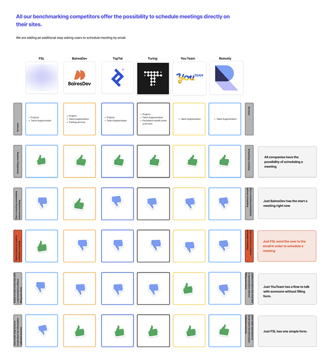
Usability tests with 8 participants reinforced what the data was suggesting:

6 of 8 interpreted "Talent" as a job board, not an allocation service.

5 of 8 interpreted "Labs" as a testing space or internal resource hub, not a project launch service.

"So we get a lot of spam too in these — where it's just someone promoting their services to us."

IT
Interview participant
IT Leader

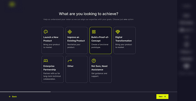
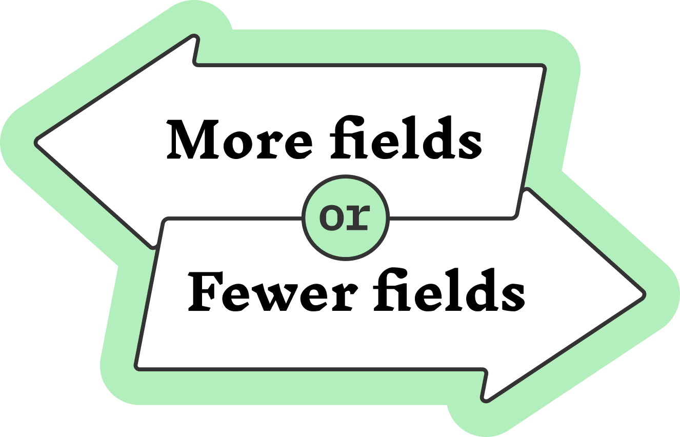
The interviews also surfaced a conflict: Marketing wanted fewer fields to reduce friction. Sales wanted more fields to better qualify leads. Both were right — and that tension shaped the solution.

04 — Approach & Process

How I got
from problem to solution.

1
Self-audit
Went through the entire contact flow as a potential client to get an end-to-end perspective before talking to anyone.
2
Behavior data analysis
Looked at impressions and unique visitors from the previous month. Talent's inflated traffic suggested the general contact flow was misdirecting people.
3
Stakeholder interviews
Interviewed IT leaders, IT managers, and design leads. Surfaced the marketing vs. sales conflict and reframed what "irrelevant submission" really meant.
4
Usability testing
Ran async tests with 8 participants. Confirmed that "Talent" and "Labs" were misread by the majority — and that the data wasn't lying.
5
Competitive benchmarking
Analyzed how competitors structured navigation and forms. Descriptive labels, multi-step flows, and a separate path for general inquiries emerged as consistent patterns.
6
Wireframing and async critique
Created wireframes, then ran a silent async critique with specialists from different areas — each reviewing independently to avoid bias.
7
Prototype and round 2 usability testing
Incorporated critique feedback, built a navigable prototype, and validated the new flow with a second round of usability tests before handoff.
05 — The Solution

Essential information first.
Details later.

Phase 1 — Quick wins: Renamed "Talent" and "Labs" with clear descriptions so people understood what they were clicking on. Removed redundant fields. Added a generic inquiry form to capture everything that wasn't a qualified lead — keeping the main forms clean.

Phase 2 — The smarter flow: The form was redesigned as a multi-step experience. The first steps captured only what was needed to schedule a call. Once the meeting was locked in, the form asked for more detail to help qualify the lead.

This solved the marketing vs. sales conflict: reduced friction early, better qualification later. And if someone dropped off before finishing — the most important thing, the meeting, was already scheduled. A progress indicator kept people oriented throughout, and every step had a clear description so people knew exactly what was being asked and why.

Audit Summary of Existing Forms and Process

Audit Summary of Existing Forms and Process

Key Findings in Competitive Benchmarking

Key Findings in Competitive Benchmarking

Figjam Documentation

Figjam Documentation

06 — Asynchronous Critique

Feedback that's
free from bias.

Before testing the prototype, I ran an async silent critique with the team. Specialists from different areas reviewed the wireframes independently — giving everyone equal space to share feedback without bias or scheduling conflicts.

Each person annotated their own copy of the Figma screens, without seeing anyone else's comments first. Patterns across reviewers carried real weight. Outliers became conversation starters, not vetoes.

Why I always do this: In group reviews, early opinions anchor the rest. Async critique removes that dynamic — and they always catch something I missed. That's exactly the point.

Figma with duplicated screens and stakeholder comments

Asynchronous critique setup — each stakeholder reviewed an independent copy to avoid anchoring bias

07 — Prototype & Handoff

A flow you can
actually walk through.

After incorporating critique feedback, I ran a second round of usability tests on the prototype. This gave additional evidence to support renaming "Talent" and "Labs," and validated the new multi-step flow.

Handoff included a clickable prototype and detailed documentation: field descriptions, clickable interactions, and developer notes. Everything was also documented in Confluence to make sure nothing got lost in translation.

High-fidelity prototype screens

Final prototype screens — the complete guided flow ready for usability testing

Handoff documentation

Handoff documentation — field specs, states, and conditional logic for the dev team

Handoff detail view
Handoff detail view

Every detail accessible to the developer — states, conditional logic, and specs per component

08 — Results

Numbers that confirmed
the approach worked.

These results were shared by my former lead while I was already allocated to another project — about two months after launch.

Clearer labels, a smarter flow, and a dedicated path for non-qualified inquiries made the difference on both sides of the form.

Before and after comparison

Before → After: the shift from a single long form to a structured, guided experience

09 — What I Learned

Three things that stayed
with me after this project.

Vague labels are a silent conversion killer. "Talent" and "Labs" made perfect sense internally — but meant nothing to people outside the company. Clarity at the entry point changes everything downstream.

The "essential first" approach works. Asking only for what's needed to take the next step — then going deeper — respects the person's time while still giving the business what it needs. It also protects the most important outcome even if someone drops off early.

Collaboration makes design better. Every critique session and every interview surfaced something I hadn't seen on my own. Having support from sales and marketing throughout helped me make better decisions at every phase.

Back to
All case studies
Next case
Rethinking Document Sending, Starting with the Basics